Belaby: A Bold Display Font That Elevates Digital Headlines
It started with a hero section—just me, a half-finished coaching website mockup, and that familiar “something’s missing” feeling. The body copy was clean, the layout balanced, but the headline lacked presence. Not just size or weight—personality. I swapped in Belaby on instinct, typed “Clarity Starts Here,” and paused. Instantly, the page felt more intentional, more human—not sterile, not overdesigned, but warmly confident. That’s when I knew Belaby wasn’t just another display font. It’s a quiet amplifier for digital voice.
What Makes Belaby Stand Out in a Web Layout
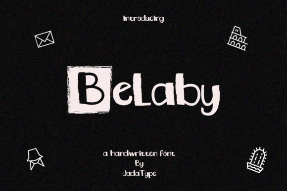
Belaby is a thick, cool-lettered display font—structured yet relaxed, bold without being aggressive. Its letterforms have subtle rhythm: rounded terminals, even stroke contrast, and generous spacing baked into the design. It doesn’t shout; it anchors. In web design terms, it’s what you reach for when you need hierarchy with heart—perfect for headlines, section titles, CTA buttons, or logo text where tone matters as much as legibility.
I tested it across real scenarios: a boutique online store banner over a muted product photo, a course sales page headline above a gradient background, and a portfolio site’s “Work” section header. In every case, Belaby held its own—not competing with imagery, but clarifying intent. Its thickness gives it excellent screen presence, even at smaller sizes (down to ~32px on desktop), and its open counters keep characters distinct without sacrificing charm.
How It Performs Responsively—and Where to Pause
On mobile? Belaby shines in hero headlines at 28–36px—but only when used sparingly and with breathing room. I paired it with generous line-height (1.3) and avoided tight letter-spacing, which can blur its friendly geometry on smaller viewports. It rendered crisply across Chrome, Safari, and Firefox, with no hint of blurriness—even on mid-tier Android devices.
That said, Belaby isn’t built for long-form reading. I tried it for a blog post intro paragraph—immediately scrapped it. Too decorative. Too present. For body copy, navigation menus, form labels, or dashboard tables? No. It’s a display font, purpose-built for moments of emphasis. Use it where users pause, not skim.
Accessibility note: While Belaby passes basic contrast checks against light and dark backgrounds (I tested #2D2D2D on white and #F8F9FA on charcoal), avoid ultra-thin overlays or low-contrast image banners. Its thickness helps, but never sacrifice WCAG AA compliance for style.
Pairing Belaby Thoughtfully in UI Design
The magic of Belaby isn’t just in isolation—it’s how it plays with other typefaces. I paired it consistently with Inter (a highly readable, neutral sans serif) for body text, captions, and interface elements. The contrast works beautifully: Belaby brings warmth and identity; Inter delivers clarity and speed. For a more editorial feel—say, a creative agency blog—I swapped in a quiet serif like IBM Plex Serif for subheads, letting Belaby remain the sole expressive voice.
Avoid pairing it with other heavy display fonts or overly ornate scripts—they’ll clash tonally. And while it *can* sit beside a delicate handwritten font (e.g., for a tagline accent), do so with restraint: one decorative element per visual zone is enough.
Real-World Implementation Tips
Before dropping Belaby into your next project, check three things:
- Webfont availability: Belaby comes in OTF/TTF, but for live sites, confirm whether a WOFF2 version is included—or if you’ll need to convert it (I used Transfonter with no issues).
- PUA encoding payoff: Yes, it’s PUA encoded—and that matters. Ligatures like “fl” and “ff”, alternate glyphs, and stylistic sets are accessible via font features in CSS (
font-variant-ligatures: discretionary-ligatures;) or design tools. I used a swash capital “B” in a logo lockup—subtle, but instantly elevated the brand feel. - Licensing for digital use: Belaby is licensed for commercial web use, including client sites and SaaS platforms—but always verify the license covers your specific deployment (e.g., embedded in a white-labeled dashboard or served via CDN).
I also tested it in Figma auto-layout components and Webflow heading styles—no rendering hiccups. It synced cleanly with variable font fallbacks where needed, and its consistent metrics made responsive scaling predictable.
When Belaby Adds Real Value—And When It Doesn’t
Belaby earned its place in my go-to kit for landing pages, portfolio headers, email campaign banners, and digital brand kits. On a recent course sales page, using Belaby for the main headline (“Design With Intention”) and Inter for benefits and pricing created immediate visual trust—readers sensed care in the craft, not just content.
Where it didn’t land: a data-heavy analytics dashboard sidebar, a multi-step checkout form, or a privacy policy page. Those demand neutrality and speed—not expression. Likewise, avoid it for small CTAs (<14px), icon labels, or anything requiring rapid scanning.
It’s also not multilingual out-of-the-box—so if your site serves extended Latin, Cyrillic, or Greek audiences, double-check glyph coverage before committing to global rollout.
At its best, Belaby does something rare for a display font: it feels both crafted and effortless. It doesn’t ask users to work to understand it—it invites them to settle in, recognize value, and stay a little longer. That’s not just typography. That’s thoughtful UX, quietly done.