Warheim: A Bold Display Font That Commands Attention Online
I was halfway through refining the hero section of a boutique coaching site when I paused—again—on the headline. It felt safe, but not memorable. The client’s voice was warm and grounded, yet the current font lacked presence. That’s when I dropped in Warheim: thick, confident, unapologetically bold. Within seconds, the headline stopped blending into the layout—and started anchoring it.
What Warheim Brings to Digital Layouts
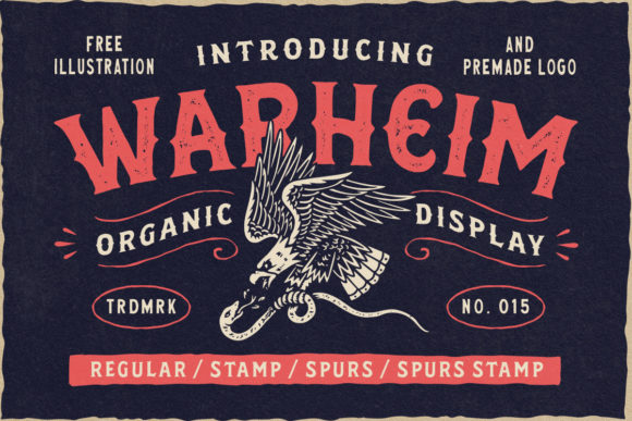
Warheim is a premium display font built for impact—not subtlety. Its letterforms are dense and tightly spaced, with strong vertical stress and generous weight distribution. There’s no delicate tapering or playful bounce here; instead, you get architectural clarity and visual authority. It reads like a statement, not a suggestion. As a display font, it’s designed for short bursts of high-intent text: headlines, section titles, call-to-action buttons, and branded banners. It doesn’t whisper—it declares.
In practice, Warheim thrives where hierarchy matters most. On a landing page for a creative course, I used it for the main headline (“Build Your Brand, Not Just Your Portfolio”) over a muted gradient background. Even at 48px on desktop and scaled responsively down to 36px on mobile, every character held its shape—no blurring, no loss of contrast. Its robust outlines rendered crisply across Chrome, Safari, and Edge, and loaded quickly as a modern WOFF2 file.
Where Warheim Shines (and Where It Doesn’t)
Warheim excels in these digital contexts:
- Hero sections — especially over image or video backgrounds, where its thickness ensures legibility without heavy drop shadows
- Landing page CTAs — “Start Today”, “Join the Waitlist”, “Get Instant Access” pop with urgency and confidence
- Portfolio site headers — gives creative professionals an immediate sense of craftsmanship and intention
- Branded campaign pages — works beautifully alongside minimalist UI elements to create contrast without clutter
- Blog post titles — adds editorial weight to long-form content while keeping scannability high
But let’s be practical: Warheim isn’t meant for body copy, navigation menus, form fields, or accessibility-critical labels. Its decorative density makes it unsuitable for small-scale interface elements—anything under 20px risks becoming illegible, especially for users with low-vision needs. It also doesn’t scale gracefully in tight vertical spaces (like mobile-stacked nav bars), and lacks the open counters needed for rapid scanning in data-dense dashboards.
Pairing Warheim Thoughtfully in Web Design
The real magic happens when Warheim meets its counterpart. I consistently pair it with a clean, highly legible sans serif—think Inter, Manrope, or even system fonts like -apple-system—for all supporting text. This pairing creates instant visual rhythm: Warheim sets the tone, and the sans serif delivers clarity. For a wellness brand site, I paired Warheim with a light-weight version of Poppins for subheads and body text—creating warmth without sacrificing readability.
You can also layer in subtle typographic texture: a restrained serif like Lora for pull quotes or testimonials adds quiet sophistication beside Warheim’s strength. Avoid pairing it with other heavy display fonts or scripts unless you’re intentionally building maximalist branding—otherwise, hierarchy collapses. And skip using Warheim for logo text that must scale tiny (favicon size, app icons) or appear in technical documentation.
Real-World Readability & Responsive Behavior
I tested Warheim across devices and conditions: dark mode, light mode, image overlays, fast-scrolling behavior, and loading states. On mobile, I capped its usage at 32px for headlines and added modest letter-spacing (0.5px) to prevent crowding. It remained fully legible—even on lower-DPI Android screens—thanks to its generous x-height and strong stroke contrast.
Over busy backgrounds? Warheim holds up better than most display fonts because its strokes don’t rely on fine details. A soft 2px text shadow (rgba(0,0,0,0.2)) was enough to ensure contrast against textured photography. No need for opaque overlays or heavy masking—just thoughtful spacing and intentional contrast.
For accessibility, I always pair Warheim with semantic HTML (, ) and ensure color contrast meets WCAG AA standards (minimum 4.5:1 for text under 24px). Because Warheim is purely a display font—not intended for functional interface text—it fits cleanly within accessible design systems when used with discipline.
Licensing, Formats, and Production Notes
Before deploying Warheim on any live site, I double-checked the license: yes, it includes full commercial web use, including SaaS platforms and client projects. The package delivered WOFF2 (for modern browsers), WOFF (for broader support), and variable font options—making it easy to serve lean, adaptive assets. No missing glyphs: Latin Extended-A is covered, along with common diacritics used in European languages.
I also verified that the font includes stylistic alternates and ligatures—but kept those turned off by default in CSS (font-feature-settings: "ss01" 0;). They’re lovely for custom headlines, but unnecessary overhead for most responsive layouts. If you’re building a brand kit or template library, confirm multilingual support matches your audience’s needs—and always test rendering in RTL contexts if relevant.
Warheim won’t solve weak messaging or poor UX flow—but it will elevate strong content with unmistakable presence. It’s the kind of display font that reminds you why typography still matters in a world of infinite scroll and shrinking attention spans. When used with purpose, restraint, and respect for its role, Warheim doesn’t just look good—it helps your message land.